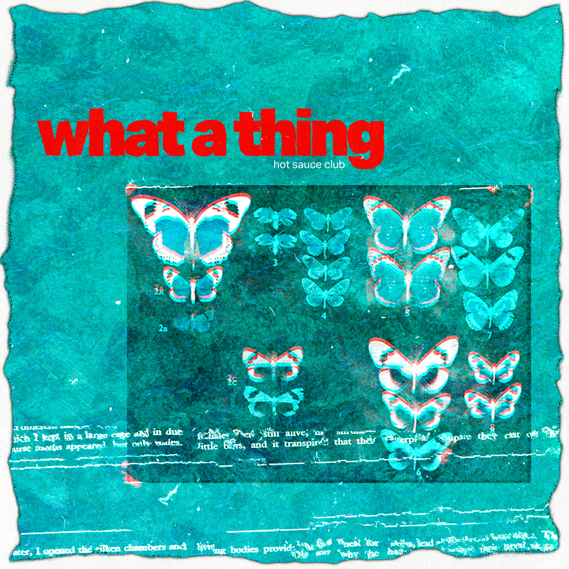
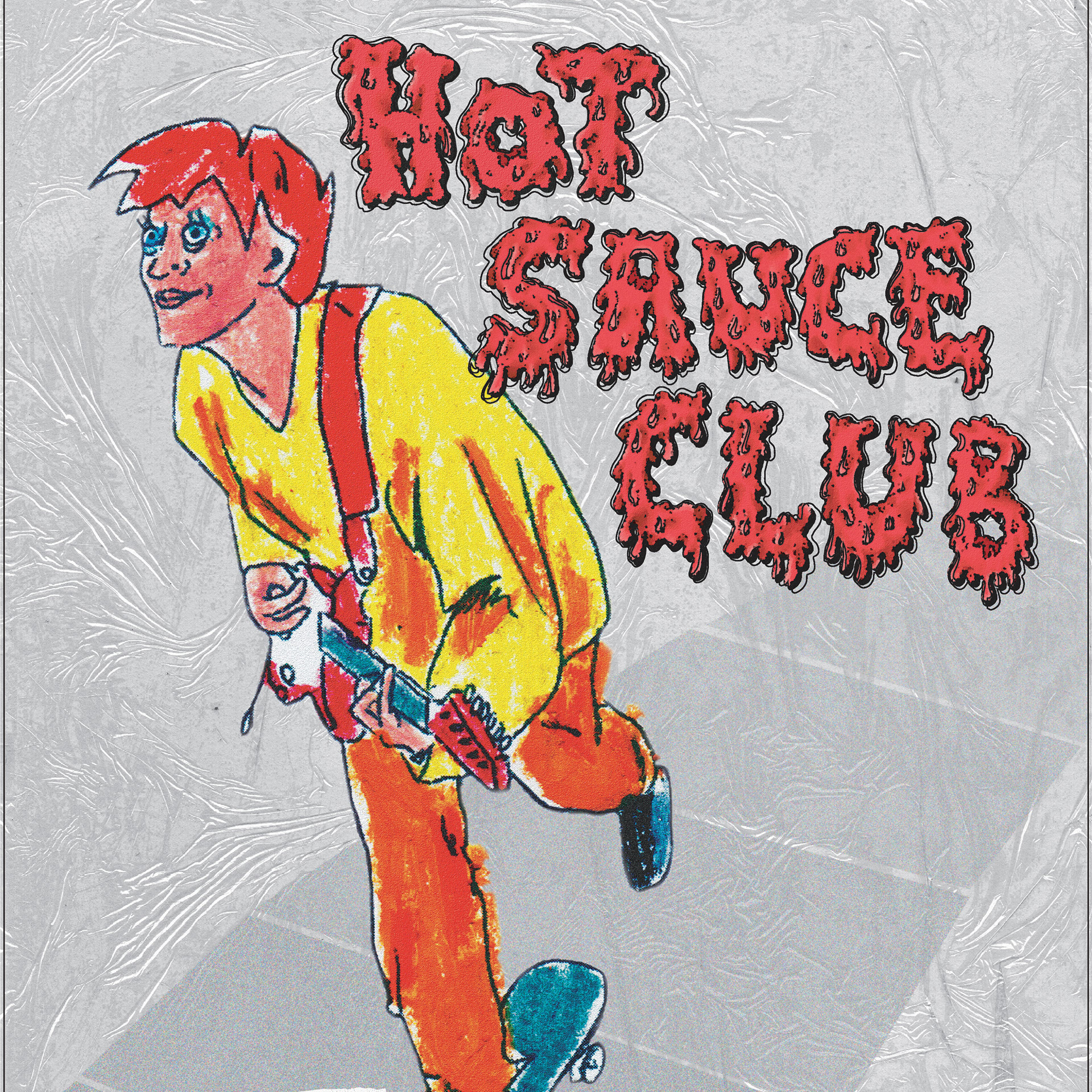
Below is a look into my workbook for this process, where you can begin to understand my thoughts and findings throughout this exploratory process. I focused specifically on form vs aesthetic, by trying to imitate contemporary typography functions while also breaking specific rules to create the previously mentioned counter-tension in the overall look of the typography - a characteristic of graffiti.


The above grid show the end half of my workbook before I made a display to. showcase the final font. I think the summary explains the process of creating this typeface better than I could do now! Below is the final showcase.